  This week students in the upper grades, 6-8th grade, worked with linoleum and lino-cut printing. We learned about safety and using sharp tools. A few finished their carving and printed their work on paper with ink. In the lower grades we learned about the artist, Piet Mondrian. He was an abstract artist and titled many of his works “Composition”(s). Students learned that a composition is the arrangement of objects or shapes in a picture and that abstract art represents an idea or feeling. In kindergarten-1st grade, students made “stained glass” with contact paper and tissue paper inspired by Mondrian in primary colors, red, blue, and yellow. In our drawings students learned about secondary, orange, green, and purple, and primary colors. Students chose one set of colors to use in designing a drawing in the style of Mondrian. Check out the display of the “stained glass” in the church entrance and see how the work of the students, inspired by Mondrian, illuminates the space!  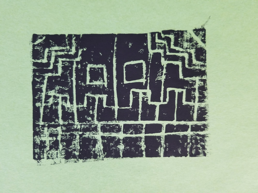 
0 Comments
 This week we revisit the artist Elizabeth Catlett. She was known for her sculpture as well as her printmaking. We are going to create out own prints with our images we make on a styrofoam tray. First practice drawing in your sketchbook with a picture of your choice. We practice in our sketchbook because we want to try first, and get it even better the next time. So once we are confident that we know and have tried our pictures we can make our styrofoam print. (avoid writing/words, if you do it will have to be backward. So if you want to try go for it!) Using a blunt end of a paint brush and using pressure on the styrofoam create your picture. Make sure your dents are deep but you don't break or rip the tray. Once you have completed your "drawing" for your print, have your paper ready you are printing on, brush a layer of paint on your print (careful not to fill the grooves with too much paint), and press onto the paper, gently lift the paper from the styrofoam. Voila! MATERIALS
 INSPIRATION Elizabeth Catlett (April 15, 1915 – April 2, 2012) Catlett was an American and Mexican graphic artist and sculptor best known for her images of the African-American experience in the 20th century, which often focused on the female experience. She was born and raised in Washington, D.C. to parents working in education, and was the grandchild of freed slaves. It was difficult for a black woman in this time to pursue a career as a working artist. Catlett devoted much of her career to teaching. However, a fellowship awarded to her in 1946 allowed her to travel to Mexico City, where she worked with the Taller de Gráfica Popular for twenty years and became head of the sculpture department for the Escuela Nacional de Artes Plásticas. In the 1950s, her main means of artistic expression shifted from print to sculpture, though she never gave up printing.   Last year I used this activity as an "ice breaker" for every classroom. For a theme to the activity the students discussed seasons. We listed what colors might be in each season these suggestions help the student make choices in their selection of colors. There is no right or wrong because many might find green in every season (evergreen in winter). I hear from the children that this is an activity they had already done (in previous years with other teachers or on other schools), I think it is so popular because the results are exciting and very vibrant and is a totally fun experiment with how material may react. Sometimes it is nice to do a project that requires little technical skill and allows for some personal choices.
 Silas Rekow, 8th Grade Schools will have events, announcements, fundraisers -you name it- that children may embrace the opportunity to advertise for. In this particular project the students that created the posters were involved in the play they were creating their advertising for Wizard of OZ The Deleted Scenes. We looked to the work of Henri Toulouse-Lautrec and his poster designs. We also discussed the information we needed to include in order to effectively communicate to our audiences, who was our audience?  Arwynne Buss, 8th Grade Materials Sketchbook Pencil Coloring Media, Colored pencils, Sharpie, Markers, Watercolor, Tempera Paper- Poster sized Brushes  Lautrec (1864-1901) eventually established himself as the premier poster artist of Paris and was often commissioned to advertise famous performers in his prints. The pinched features and animated demeanor of the singer Jane Avril, the image wearing one of her famously outlandish hats with a snake, are subjected to the artist’s crystallizing vision. By exaggerating the characteristic features of women performers, Lautrec conveyed the essence of their personalities.
 I created this project after researching the renaissance artist Donatello. During the time period in which Donatello worked he used a new, very shallow, sculptural technique called Bas Relief. This is the basis of coin design. The students were told to think of a symbol/animal. An addition to the original project, students could include a creative writing exercise. Students would create a country, listing the demographics of their coin of origin. Design of the coin should include one number and one symbol. When making their projects students should understand that the the bas relief process is reductive not additive. When using air dry clay, students may need to work when it is on the dryer side. Materials Sketchbook Pencil Clay Clay tools Newspaper  Inspiration
Donatello 1386-1466 He worked with stone, bronze, wood, clay, stucco and wax, and had several assistants, with four perhaps being a typical number. Though his best-known works were mostly statues in the round, he developed a new, very shallow, type of bas-relief or small works, and a good deal of his output was larger architectural reliefs.  In this lesson students learned about the Pop Art movement of the 1960's and looked to the work of Roy Lichtenstein and referenced vintage Batman episodes with exclamatory words, like POW, SOCK, ZOINK. We used our sketchbooks to practice illustrating our words. Students were also given the option to created a comic drawn portrait, like Mr. Lichtenstein. To create a manufactured look students learned masking techniques and used bubble wrap to create their project with some low-tech stamping and masking.  Materials Sketchbook Pencil Canvas/illustration board/heavy paper Paint Masking tape Bubble wrap Brushes  Roy Lichtenstein (1923-1997) became a leading figure in the new art movement of the 1960s, called “Pop Art”. His work defined the premise of pop art through parody (an imitation of the style of a particular writer, artist, or genre with deliberate exaggeration for comic effect). Inspired by the comic strip, Lichtenstein produced precise compositions that documented while they parodied, often in a tongue-in-cheek manner. His work was influenced by popular advertising and the comic book style. He described pop art as "not 'American' painting but actually industrial painting". Lichtenstein's technique, which often involved the use of stencils, sought to bring the look and feel of commercial printing processes to his work. Through the use of primary colors, thick outlines, and Benday dots, Lichtenstein endeavored to make his works appear machine-made.
|
AuthorI have a passion for the visual arts and love sharing it with others. I have enjoyed teaching all ages and love to incorporate art history and traditional disciplines as well as innovative ideas. Art is vital to who I am as a creator and educator. Archives
August 2023
Categories
All
|
 RSS Feed
