 Silas Rekow, 8th Grade Schools will have events, announcements, fundraisers -you name it- that children may embrace the opportunity to advertise for. In this particular project the students that created the posters were involved in the play they were creating their advertising for Wizard of OZ The Deleted Scenes. We looked to the work of Henri Toulouse-Lautrec and his poster designs. We also discussed the information we needed to include in order to effectively communicate to our audiences, who was our audience?  Arwynne Buss, 8th Grade Materials Sketchbook Pencil Coloring Media, Colored pencils, Sharpie, Markers, Watercolor, Tempera Paper- Poster sized Brushes  Lautrec (1864-1901) eventually established himself as the premier poster artist of Paris and was often commissioned to advertise famous performers in his prints. The pinched features and animated demeanor of the singer Jane Avril, the image wearing one of her famously outlandish hats with a snake, are subjected to the artist’s crystallizing vision. By exaggerating the characteristic features of women performers, Lautrec conveyed the essence of their personalities.
0 Comments
Mono-printing is a form of printmaking that has lines or images that can only be made once, unlike most printmaking, which allows for multiple originals. Students were introduced to Mary Cassatt and her work during the impressionist period, particularly her technique in making monoprints. Students created a painting in tempera on a cookie sheet and quickly transferred the print to a piece of paper.  Materials Sketchbook Pencil Clean cookie sheet Tempera Paint Brushes Paper  Mary Cassatt (1844-1926) was an American painter and printmaker. She was born in Pennsylvania but lived much of her adult life in France, where she first befriended Edgar Degas and later exhibited among the Impressionists. Cassatt often created images of the social and private lives of women, with particular emphasis on the intimate bonds between mothers and children.
 In this lesson students learned about the Pop Art movement of the 1960's and looked to the work of Roy Lichtenstein and referenced vintage Batman episodes with exclamatory words, like POW, SOCK, ZOINK. We used our sketchbooks to practice illustrating our words. Students were also given the option to created a comic drawn portrait, like Mr. Lichtenstein. To create a manufactured look students learned masking techniques and used bubble wrap to create their project with some low-tech stamping and masking.  Materials Sketchbook Pencil Canvas/illustration board/heavy paper Paint Masking tape Bubble wrap Brushes  Roy Lichtenstein (1923-1997) became a leading figure in the new art movement of the 1960s, called “Pop Art”. His work defined the premise of pop art through parody (an imitation of the style of a particular writer, artist, or genre with deliberate exaggeration for comic effect). Inspired by the comic strip, Lichtenstein produced precise compositions that documented while they parodied, often in a tongue-in-cheek manner. His work was influenced by popular advertising and the comic book style. He described pop art as "not 'American' painting but actually industrial painting". Lichtenstein's technique, which often involved the use of stencils, sought to bring the look and feel of commercial printing processes to his work. Through the use of primary colors, thick outlines, and Benday dots, Lichtenstein endeavored to make his works appear machine-made.
 Milo Gehring, 8th Grade In this lesson the students studied the aboriginal paintings in Australia. Although the technique, style, and concept of the dot Aboriginal painting of Australia was not taught first hand to me, I would like to teach appreciation and the style to students. We can respect indigenous cultures through emulating the work. Students were told they could focus their painting on a design or an animal. "As Aboriginal artwork is a form of visual storytelling, each tribe has symbols that relate to a meaning. There are iconic symbols too, which are relevant to multiple tribes and include eagle feet, waterholes and digging sticks. Colors can be linked to meaning as well, but this is rare, and only some tribes can understand what colors relate to which meaning. Blue tones (to represent the ocean) and warm tones of brown and orange (to represent the earth) are most commonly used. The symbols can also be used for teaching purposes, catering to both children and adults. Depending on the audience, each piece of iconography will differ in meaning, but the essence of the story will be the same. It seems obvious, but Aboriginal artwork is only considered Aboriginal if painted by someone who is of that origin. A non-Indigenous Australian does not have the authority to paint an Aboriginal piece of artwork. Where the artist comes from will inform how the painting will look. Since a non-Indigenous artist is not from a particular tribe, that person cannot represent any form of Aboriginal art. But this does not mean that all other ethnicities are banned from creating their own artwork. There are many workshops around Australia, which are open to anyone who would like to learn more about the art form." https://theculturetrip.com/pacific/australia/articles/10-things-you-should-know-about-aboriginal-art/  Materials Sketchbook, Drawing media Dark construction paper, Black, Brown, etc Q-tips, round brushes Tempera paint (lighter colors) Visual aids for inspiration
I really enjoyed teaching this lesson. The children also seemed to enjoy creating and learn through this project. Since it was very early in the year I feel that I did not focus on parts of the lesson that would have really created some deep learning moments. We discussed and talked about gothic architecture and I asked them what they knew about cathedrals? Most of them knew little, but that gave us an opportunity to discuss the parts of the cathedral and why the buildings had been able to have more windows, more light. We looked to stained glass windows, particularly the rosette window. In this project students create a "stained glass" window design and transfer the window design to a plastic protector sheet with permanent marker. On a black piece of paper student create an outline of the cathedral or building the window would be in. I was pretty loose on design of the window. In the future possibly keep the design to symmetry and possibly types of architecture. Although I really enjoy giving the children freedom of choice and these students did quite well.  Materials Sketchbook Pencil Paper Circle template Plastic pocket protector Permanent Markers Tape White crayon Black Paper  Inspiration
Gothic Cathedral Built during the 12th through 16th centuries, these medieval masterpieces were born out of the Romanesque movement, which saw churches designed with thick walls, round arches, and large towers. Gothic architecture, on the other hand, focused on height and light—despite being constructed from heavy stone, Gothic cathedrals seem to defy the laws of gravity. Common traits include pointed arches, ribbed vaults, and flying buttresses, all of which enabled the structures to be built taller and stronger. Without the thick walls churches could have more windows to allow light to shine into what would be rather dark worship spaces. This also allowed for stained glass in colorful designs to be utilized to represent the stories of the bible.  In this lesson the students combine observation, collage, and drawing. The students first create a collage of black and white print on which they draw a linear portrait in the style of Picasso. The collaged black and white print creates background in the style of the cubist movement. Students reference and look at portraits Picasso painted in his later works. They will observe that the faces he paints become a collection of shapes that represent facial features. After their portraits are drawn in black permanent marker, the facial planes are filled in with colorful oil pastel.  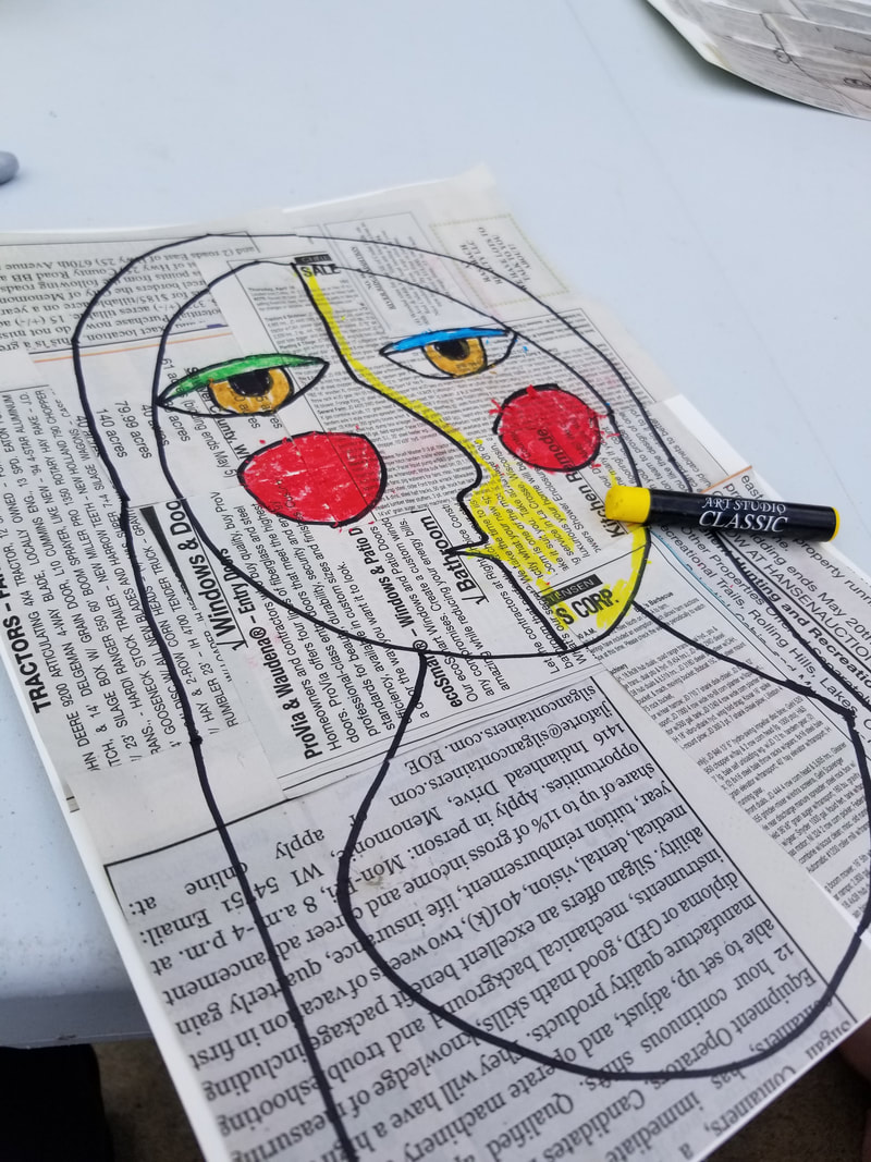 Materials Heavy weight paper Scissors Newspaper Glue/Glue sticks Permanent Black Marker Oil Pastel  Inspiration
Pablo Picasso 1881-1973 Picasso displayed an interest in subject matter of every kind. Picasso was exceptionally prolific throughout his long lifetime. The total number of artworks he produced has been estimated at 50,000, comprising 1,885 paintings; 1,228 sculptures; 2,880 ceramics, roughly 12,000 drawings, many thousands of prints, and numerous tapestries and rugs. Picasso's early sculptures were carved from wood or modeled in wax or clay. Picasso abandoned modeling and instead made sculptural constructions using unconventional materials. Although his Cubist works approach abstraction, objects of the real world as subject matter were never completely unrecognizable. Prominent in his Cubist paintings are forms easily recognized as guitars, violins, and bottles. Picasso painted mostly from imagination or memory. In his paintings, Picasso used color as an expressive element, but relied on drawing rather than subtleties of color to create form and space. Picasso transformed the semiology (the study of signs and symbols and their use or interpretation) of painting and sculpture, expanding the way words, shapes, and objects could interact. He put ordinary objects in new situations that changed their nature. Many of his portraits are As much as I would like to claim that this was such a wonderful lesson, I must confess.. Although many successful drawings were created by the students, we had an "incident" as my 8 year son old would call it. On the day of art class for grades 4-8 about 11 students, I had gathered white legos for the subject matter. I began class by explaining the lesson, covering the paper with charcoal. I then demonstrated erasing the form on the page. I explained the point was not add to the page but erase. I then handed out the lego(s), paper, charcoal, and an eraser. First instruction cover the paper with charcoal. I didn't see it coming. I had no Idea! In a matter of seconds from one child thinking it was funny to put charcoal under his eyes, the chain reaction cause about 6 of the 11 to cover their faces entirely in charcoal. It never occurred to me (why would it?) that the students would interpret the use of the materials as a free for all on covering parts of their body. As I said every student attempted the lesson and many were successful. The last half of class was directing the ones with war paint to the sink, and cleansing before dismissal. We also had a discussion over the proper use of art room materials. "If materials are not used properly on paper, canvas, etc and instead put on our bodies, we will have to be limited to pencils and paper." 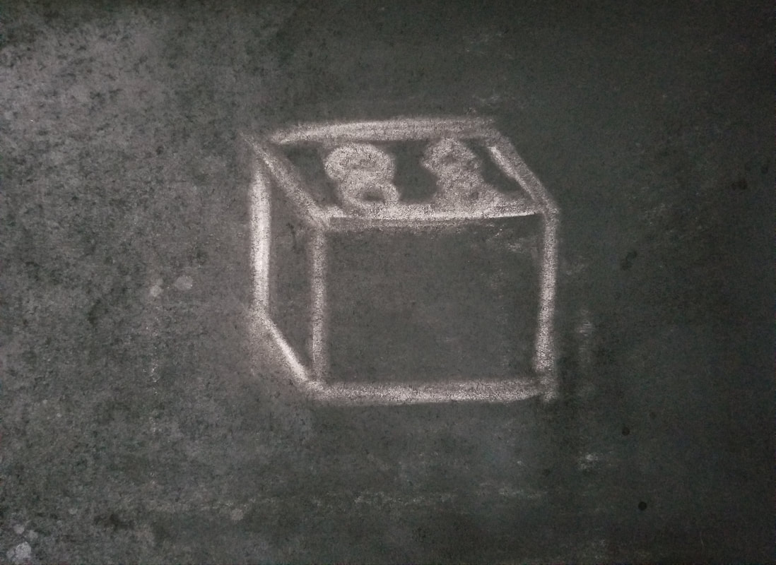 Materials
Paper White Legos Charcoal Eraser In this unit, students create a mythical creature by researching, writing, and drawing, and choosing at least three characteristics of three living creatures. The students then transform their ideas into a 3D version.  Materials Visual Aids of Living creatures Sketchbook Pencil Colored Pencils Paper Newspaper Paper tubes Masking tape Glue Tissue paper  Inspiration
Roberto Benavidez 1973 “The greatest influence on my recent work is the piñata,” explains multidisciplinary artist Roberto Benavidez. His papier-mâché and crêpe paper versions of beasts and demons plucked from Hieronymus Bosch ’s The Garden of Earthly Delights (c. 1450) have become something of a viral sensation. Piñatas are usually considered a throw-away amusement, designed to be hung from a tree and smashed up by kids at a birthday party, but Benavidez treats the form seriously. His Bosch-inspired sculptures—faithful 3-D reproductions of the painting’s strange characters—are elegant, funny, and a little frightening. The larger piñatas in the series are the size of small children, with delicate layers of crêpe paper covering their bodies like fur or feathers. Benavidez, who identifies as mixed-race, feels a cultural connection to piñatas as a sculptural form that has been a part of Mexican Catholic traditions since the 16th century. “By drawing from Western art imagery and incorporating Italian crêpe paper in my work, I’m touching upon the craft’s history, as well as highlighting its parallel to my own identity,” he explains.  There are so many concepts packed into this project. I love teaching expressionism, music, and color theory which is incorporated throughout the unit. On the first day the class is introduced to Mr. Kandinsky and expressionism. Students are also introduced and learn about his contemporary Sergei Prokofiev and his symphony Peter and the Wolf. We read a story of Peter and the Wolf illustrated in an expressionist style and listen to the Introduction to the symphony hear the different instruments represented by different animals. While we do sketchbook practice I demonstrate line variations, children brainstorm a list. During the first class we paint up to 4 line paintings in black tempera, while listening to the symphony giving the students "inspiration". The second day of class we talk about expressionism and color we talk about Warm colors vs. Cool colors. We talk about which those colors might represent. Students are given a limited analogous palette of warm colors, and cool so their paintings do not mix. They fill in the line paintings with the color tempera. On the third day students paint in the line with Rainbow. We discuss the order in which the color spectrum occurs. They emulate the rainbow in watercolor on their line painting. The results are really neat, with so much variety. There is so much depth and learning going in this lesson unit that I can see many variations in the future.  Materials Peter and the Wolf, Illustrated Book Peter and the Wolf Symphony, Prokofiev, Andre Previn Sketchbook Paper Tempera paint Watercolor Brushes Water cup  Inspiration
Wassily Kandinsky 1866-1944 Kandinsky was a Russian born artist who made his name working in Germany in an art style called Expressionism. Expressionists wanted to use art to express their feelings and emotions, usually through bold use of line and color. Kandinsky studied law and economics in school, and was very successful in his career, but he also loved art, and eventually decided to do art full time, even becoming an art teacher. As a child he was also interested in music, learning to play both the piano and the cello, and this was an interest that inspired a lot of his art. In fact, many of his paintings were titled as if they were songs or musical works, like "Composition" and "Improvisation." Kandinsky was inspired by was COLOR. He felt that color could convey emotion even without showing any particular object or figure. Color on its own could tell the story of his art. Kandinsky was one of the first artists who painted purely ABSTRACT works of art, meaning he abandoned any reference to recognizable reality in his work.  Cana Rose, Kindergarten “Nobody sees a flower - really - it is so small it takes time - we haven't time - and to see takes time, like to have a friend takes time” Georgia O'Keefe. Depending on the ages of the students this project is a matter of observation or magnification. For younger students we observe a picture of the of the flower. The flower is drawn in pencil and colored pencil and water color is used to fill in the color. For older students we use a view finder and isolate part of the flower to magnify. The flower is drawn in colored pencil and/or painted with watercolor.  Sean, 2nd Grade Materials Pencil Colored Pencils Watercolors Brushes Watercolor paper Inspiration
Georgia O'Keefe (1887-1986) Was an American abstract painter born in Wisconsin. She attended the Art Institute of Chicago, the Art Student’s League in New York, and Colombia Teacher’s College in New York. She was an art teacher before she became a full time artist. She was a leader in the development of the American Modernism Movement. O’Keeffe painted still lifes, massive flowers, the New York at Night series, southwestern landscapes and stark bones found in the desert. In 1939, she was selected as one of the twelve most outstanding women of the past fifty years by the New York World’s Fair Committee. Her painting, Sunset-Long Island, was chosen to represent New York in an exhibition of the art of the United States at the World’s Fair. In 1985, O’Keeffe was granted the Medal of Arts by President Ronald Reagan. |
AuthorI have a passion for the visual arts and love sharing it with others. I have enjoyed teaching all ages and love to incorporate art history and traditional disciplines as well as innovative ideas. Art is vital to who I am as a creator and educator. Archives
August 2023
Categories
All
|


 RSS Feed
